Bad Game, Good Teacher
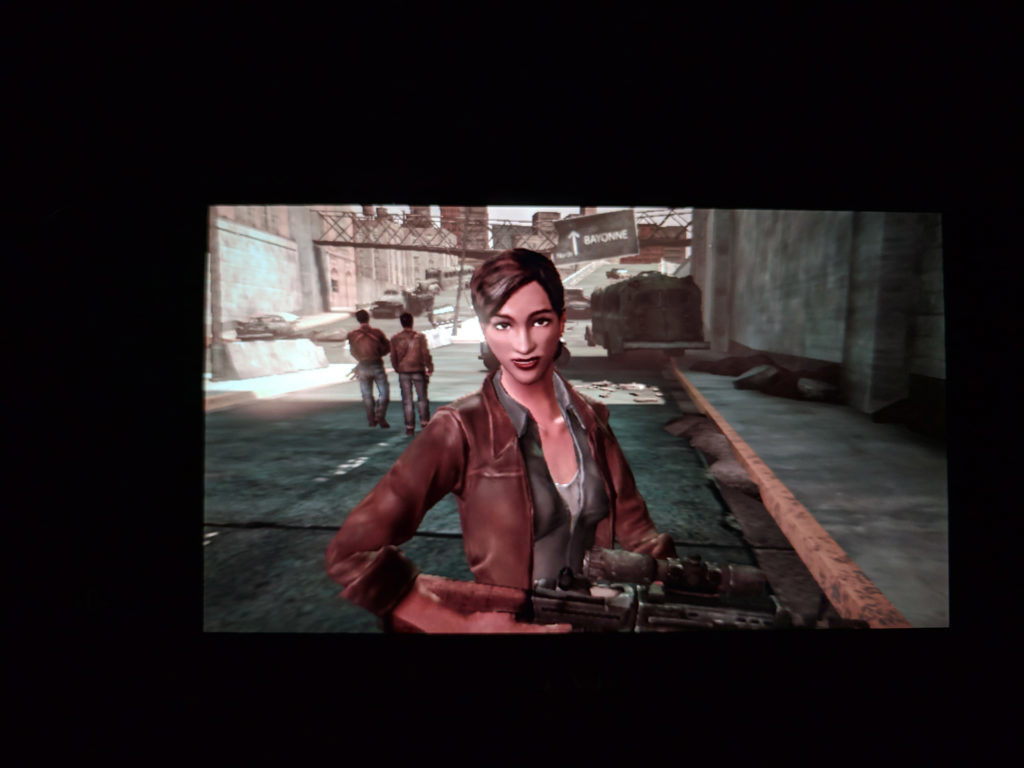
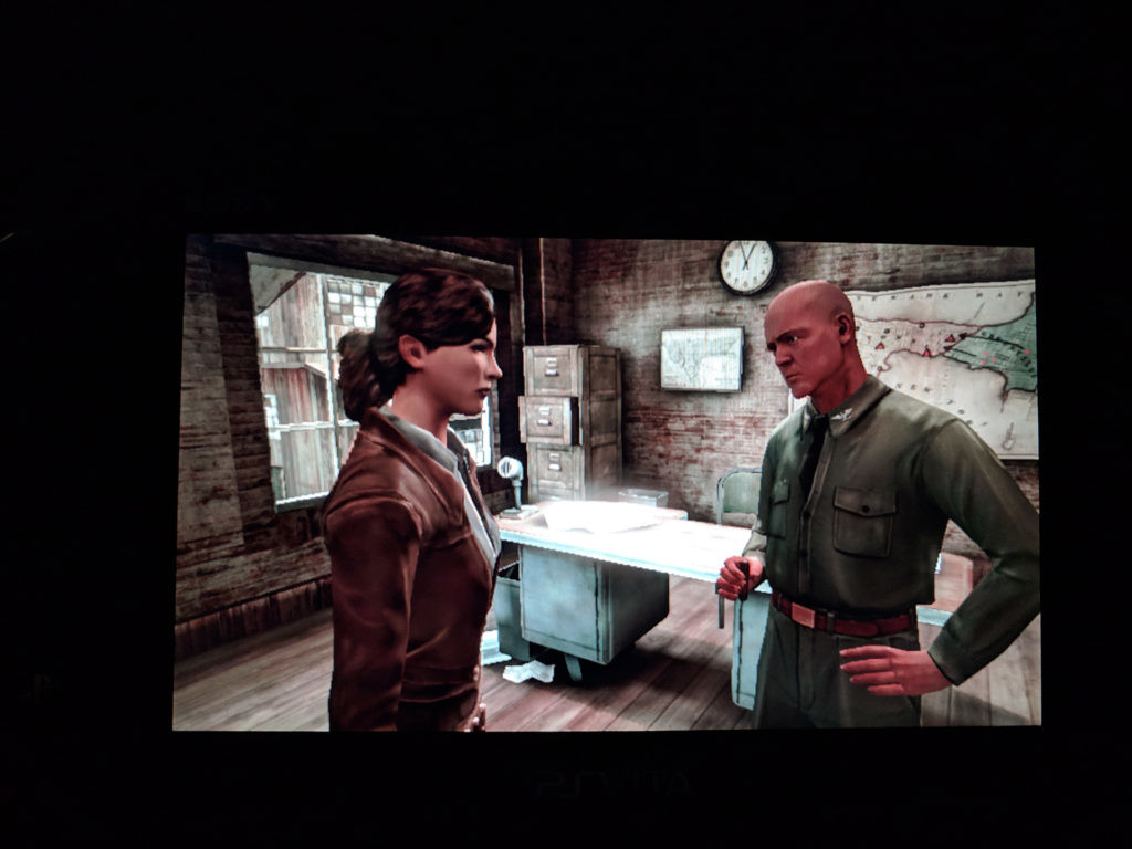
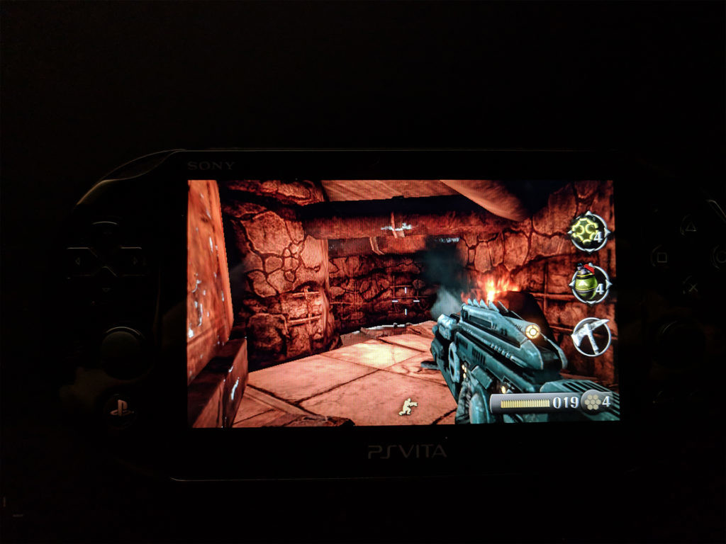
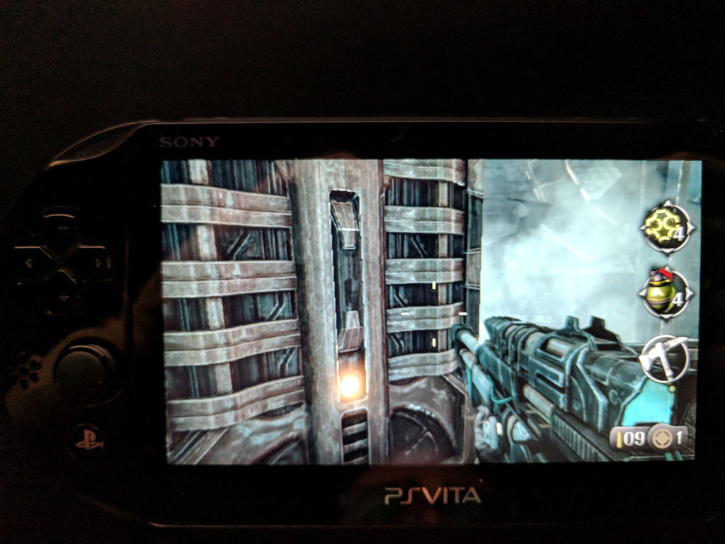
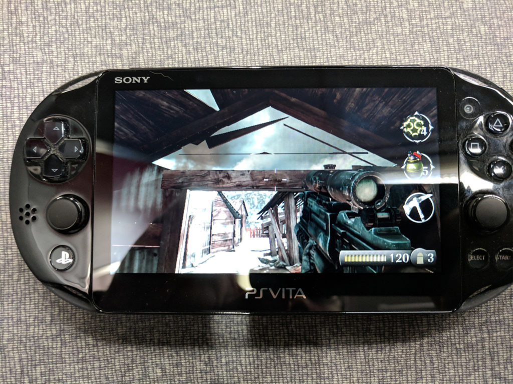
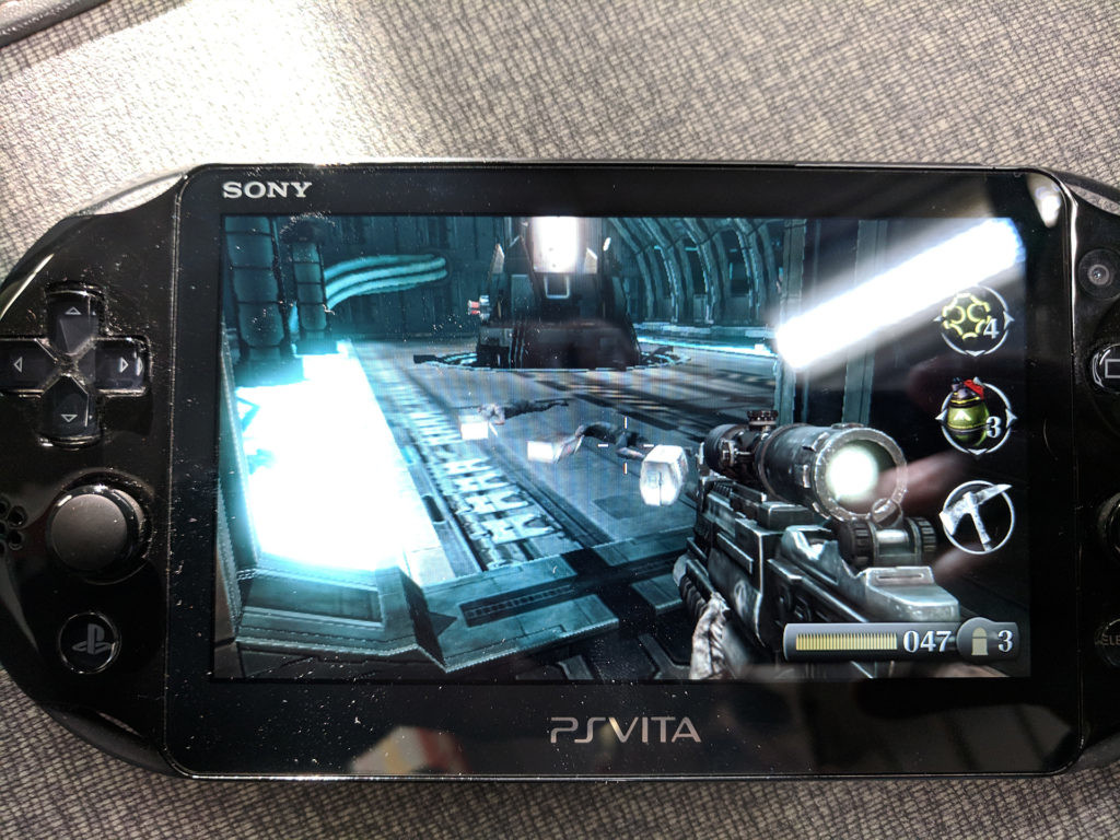
All images captured from my Pixel on a train or at my desk as Burning Skies does not allow for screenshots.
Prior to purchasing my laptop, I would play about an hour or two of my Vita a day on my commute. It’s a great little machine and it’s one of my distractions during long travel times. I vary games based on my mood. Recently, I had been in the mood to shoot monsters in the face. I picked up a used copy of Resistance: Burning Skies on a whim in Austin, TX last year and had it sitting on my shelf. I was aware of its reputation when I started playing and was prepared for the worst.
Let’s get this straight before I dive into the meat of the blog; while I had mostly a good time playing the game, Resistance: Burning Skies is not a good game. It has a few redeeming qualities, including fun core mechanics, but the overall package is almost (but not quite) as bad as advertised. Having said that, Burning Skies is also an incredible teaching tool that deserves attention.
Let’s set the stage for Resistance: Burning Skies.

PART I: BUSINESS AND DEVELOPMENT
A brief overview of developing on unreleased evolving platforms
In 2010, I got my first job at Sony Bend. I was the last contact artist hired on to work on Uncharted: Golden Abyss. I have many fond memories of working on the game and I’ll probably always have rose colored glasses when it comes to that studio.
Golden Abyss was a launch title for the Vita. When I started, only a few of the team members had dev kits. Sony was in the process of finalizing the hardware and form factor of the Vita and didn’t have enough dev kits to hand to everyone. In fact, the first dev kit the studio had was nothing more than a motherboard like PCB in a clear glass or plastic case. Most of the team was actually using PS3 dev kits and estimates of what the Vita was capable of during the early months of development.
We were pretty close on those estimates actually.
This was likely the case at many studios working on Vita games at the time. Bend was working on the flagship title and likely got hardware early, but even about 8 months out from the Japanese release, most of us still had dev kits that weren’t final. Often, we’d need Frank or Chris to verify everything looked correct color wise. This was because most dev kits were using cheap TFT or LCD panels until closer to the final Vita release. There are shots out there of Vita Dev kits that look like the PSP Go. During the time when Sony was working on the form factor, this was being considered and was why we had them. These kids came with cheap screens. However, Frank, the acting Art Director, and Chris Reese, one of the studio owners and a lead engineer, had close to final hardware with the final screen technology; the glorious AMOLED screen that the Vita would be known for. Colors often looked different on their hardware so we needed to check with them often.
This was just one of the issues that came up working on our launch title, and we were Sony first party. Nihilistic, the developer behind Resistance: Burning Skies and Call of Duty: Black Ops DeClassified was a hired gun with (likely) a smaller budget. I would wager that any issues we had, they had worse.
Uncharted: Golden Abyss came out to mostly positive reviews and is still one of the best looking games on the platform. Resistance: Burning Skies came out to mixed to poor reviews and looks like a PSP game at points. Why the disparity in quality?

Time and Money: Nihilistic Software pulls double duty
While not released at the same time, both of Nihilistic’s Vita games (Resistance and Call of Duty) came out pretty close to one another (5/29/2012 and 11/13/2012). It’s pretty clear that both games were being developed at the same time. Games take a long time to make, AAA titles even more so. Even the big studios that handle multiple projects at once need more time than 6 months to release entire games. Portable games usually require a bit less development time, but but the schedule Nihilistic had to have been on while making both titles would have made it nearly impossible for them to succeed with both.
In a sense, they didn’t. Resistance has the core of a good game in it and a Metacritic of 60. Call of Duty had a score of 33 and by most accounts is horrid.
I haven’t played Call of Duty Vita yet.
Why would a studio try to take on so much work? Money. How do I know? I’ve done it myself through a practice I like to call “Stacking Clients”
Stacking Clients is the practice of taking on two or more client projects at the same time. This is a common practice for freelancers, contractors, and work for hire studios. You stack clients for a variety of reasons. Some clients can only offer a fixed amount of work a week, and if you have enough additional time, you can add another client. Other times, client schedules create a gap where you can add additional clients and work around the gaps. Money is also a motivating factor. If your income is falling short of what you expected for a given period of time (or you’re poor and grasping for any work), you’ll attempt to stack clients in order to maximize your cash flow.
Stacking Clients can be very effective, but you must be careful as it can also lead to failure and burned bridges.
I have always had some sort of client stacking as a freelancer. But in mid to late 2014 I took it overboard by trying to work with 4 clients at once. It did not go as well as I would have liked. I was working for 4 clients simultaneously: Iron Belly, Motion Logic, Hangman Digital, and Polydigital SE. In addition, I was working on an art test for Boss Key Productions. This led to a number of issues:
- My work with IronBelly suffered the most. There were more issues than just the client stacking, but I wasn’t able to sufficiently devote my time to really matching the vision that the art leads on the project I was working on were looking for. It became an issue and my relationship with Iron Belly suffered. While we didn’t end on bad terms, I only occasionally worked with them again.
-
My Boss Key art test was rushed and not great. I learned a lot while doing it, but it wasn’t something I was able to do properly with that client load.
- Even so, I’m not sure I would have been able to pass the test anyway.
- I was burnt out with Hangman Digital and tired of being paid slowly by them. Luckily this was my last month of work for them.
- My work for Motion Logic wasn’t the best I had done for them but it got the job done.
When stacking clients like that, it’s often best to sub-contract. Unfortunately for me at the time, I needed all of that cash for myself. It’s a bit trickier to subcontract as a sole proprietor, and having to separate myself from 30% of my income or more at that time was not an option.

Warning: Pure Conjecture Ahead
Everything I’m about to say in this section is 100% guess work. I did not ask anyone who formerly worked at Nihilistic about what happened during the development of their Vita games. I am not a journalist. This is my hypothesis based on my personal experience as both a developer on a AAA Vita game as well as a Freelancer who took contracts to pay the bills.
*Clears Throat*
It is my personal belief that Nihilistic and Sony agreed on a set budget to develop Resistance: Burning Skies before they ever agreed to work on Call of Duty. As development wore on, Nihilistic probably underbid the actual cost of the game to win the contract and needed more money. After the impressive NGP demo in early 2011, Activision was probably looking for takers on a Call of Duty port. Nihilistic, needing a cash infusion and likely not having any luck re-negotiating with Sony (remember, at this time the global economy was poor and Sony was hurting pretty bad) stepped in and bid for Call of Duty and got their cash infusion.
Unfortunately, this means they had two games to deliver in a very tight time frame: Early Summer 2012 and Fall 2012.
This probably led to resources for both games being constantly shifted. Resistance likely remained the main focus while a smaller team split off and took the engine used for Resistance and re-worked it for Call of Duty. As work on Resistance wrapped up, the team shifted over to Call of Duty. Resistance probably got rushed so that Call of Duty could be worked on, which got rushed so it could hit it’s release date.
These rushed games were then put out. Sony didn’t want to spend more to polish Resistance, and Activision likely didn’t care. They figured anything with Call of Duty on it would sell (they were right).
Unfortunately for Nihilistic and the team, these two games were brutal enough that they would eventually re-brand and close up shop. It’s sad too, as Resistance had enough good qualities in it that I found the game to still be fun enough to finish.
PART II: The kernel of a good game
The kernel
Resistance: Burning Skies has the soul of a good game in it. If you look past it’s laundry list of flaws, you can see something that just needed more time in the oven. At its core, there is enough mechanical proficiency and generally acceptable story telling that it’s not a chore to play though the game.

- Shooting is very enjoyable throughout the majority of the game. It plays very much like it’s big brothers on PS3. Shooting feels accurate and punchy. You can’t play fast like in an older shooter due to control issues and movement speed but it plays pretty closely to Resistance 1 and 2. This is a good thing.
- While nothing in this game looks spectacular, there are some points in the game where the visuals are relatively ok. Some locations and enemies really mix the mechanical and organic blending that the Chimera showcase.
- The story in Resistance is pretty generic. It plays and feels like a B movie through and through. There is just enough in the story to keep the player motivated to play through the game and see how it all ends, while understanding that it’s not going to have any real twists and turns to it at all.
- The Resistance franchise is known for it’s diverse and unique weaponry and that does not change here. In fact, it’s part of what makes the combat relatively enjoyable. This also leads to my final point:
- Most Vita games did not have good use of the Touch Screen at all. I happen to think that Burning Skies has an appropriate use of the Touch Screen and it absolutely aided combat in many ways.
The Burning Sky
Despite the things this game does adequately, in the end this game still showcases why it earned its reputation. The core of the game was not able to make up for the diversity and severity of its flaws. Just about everything that goes wrong with a rushed game went wrong here, as well as a few problems that I’ve just not seen before.

-
While there are a few solid looking areas to the game, on the whole the game looks like a muddy mess. The further in the game you play, the less diverse the levels become and the muddier and older they look. One of the last levels looks as if it could have been ripped straight from the PSP game Resistance: Retribution, including mesh splits along UV’s that you would notice in PSP games specifically. Outside of a few OK areas, this game is visually ugly.

- I also found some odd environment art choices too, as if someone didn’t remember to add proper blockers or to split their UV’s in a way that made sense.

- The sound design for this game is horrible. Music either cuts in or out at the wrong times and it never sticks around long enough for you to feel as if you are in an epic fight. There is a chance that this was done to keep the feel of the first Resistance game, but it doesn’t work. What shocked me the most was the sound of the guns. For a series that’s known for its innovative weaponry, they sound like tin can versions of their PS3 brethren here. Much of the game’s audio sounds like a tin can, with only some dialogue lines managing to sound acceptable.
-
Level design is an art form in and of itself. I am not much more than a junior junior designer, but I have enough experience making games and playing shooters to know what doesn’t work. Resistance is filled with a number of level design sins that, again, creep up more and more the further into the game you play.
- The early levels are generally dense and varied when it comes to level design. There are a few issues, usually revolving around over long tutorial sections and corridors, but it doesn’t feel like the game is failing.
- At about the mid way point, levels start to resemble the hallway->arena->hallway->arena formula. This can work if your arena is large or gives you multiple options for combat. Unfortunately, arenas in Burning Skies are small and have only one way out. This reduced the possible gameplay to “find cover and survive”. This is a common problem in mobile shooters because of the limited control options-stop and pop gameplay is ideal. On Vita, it’s less needed thanks to the dual analog sticks. Additionally, it’s a very old design philosophy.
- Towards the end, arenas stopped being fairly interesting and became literal ovals or squares with a few floors for enemies to snipe you from. This led to not creative solutions other than “memorize the order in which the enemy spawns”. This was BRUTAL and I hated it a ton. Memorization once in a while is fine-even for combat areas. This was the entire premise of the last few levels.


- A very big problem with this game is its lack of enemy diversity. It’s hard to keep the player engaged when you have 4 or 5 core enemies and 1, single, boss. That’s right. You fight a few bosses throughout the game but, with one exception, they are all the same boss with a giant gun on his left arm. This boss is basically Barrett from Final Fantasy VII. There is no trick to his versions either. You swap to the Bullseye, tap on his gun arm, and fire at will. Easy. When you’re lacking in enemies to this extent and don’t have design to free the player up to make combat interesting, you snowball your problems.
-
The lack of enemy diversity and poor arena design come together to form a perfect example of the problems the end of this game has: The Final Boss. The final boss in Burning Skies is a hulking behemoth of a Chimera, which is fine. He has particular weak points you need to hit in order to take him down, and that is fine too-quite old school actually. What I didn’t find endearing was how quickly he takes down your health, how simplistic his patterns are, and how poorly designed the final arena is. It is, more or less, two rectangles. The main challenge with dealing with this boss is the combination of his weak spot locations (fair), the significant damage he causes (borderline fair), and the design of the level (bad) not letting you have a fighting chance. Running from side to side in a game with a painfully slow running speed does not really make for a fun experience.
- The last, and possibly created problem when combined with the generally poor arena design, is the AI. These are some of the dumbest, least interesting enemies I’ve fought in a shooter in the last few years.

Lessons to Learn
I think the biggest takeaway from my overall analysis revolves around the business side of handling multiple projects. By all accounts, Resistance is far and away a better game than Call of Duty: Black Ops Declassified. Weather that’s because it had a bit more time in the oven we can only guess. Either way, this is what usually happens when one juggles multiple projects. This has been the story of my freelance career the majority of the time. When I juggled two clients, Gametextures articles, and teaching a full course load, usually something had to give.
That’s not to say ‘don’t do it’, but definitely plan better when you need to Stack Clients.
My next big lesson was how much I noticed the poor, repetitive level design the further in the game I played. Don’t scope down your final levels. While no level in Burning Skies is large, early levels felt interesting and organic enough that the size wasn’t an issue. Instead of building these concepts out later in the game to allow for more player freedom to attack combat, the team crunched it down. The player was funneled between monster closets via simplistic tunnels that pretty clearly repeated over and over. The final boss level, which generally should be a big showcase and spectacle for the game, was a platform with cylinders. It’s as if it never made it past the block-out stage.
Cut the bad levels and shrink the game if it’ll help the game feel non repetitive and finished. I was surprised by how much I noticed these design issues and how much they bothered me as I played.
Oh and please do a better job of hiding event triggers (be they volumes or other things). You literally know exactly when the monster closet starts when you walk through the door. You could however stand here indefinitely and nothing would ever spawn (see below).
The AI was the other big sticking point for me in the game. It’s hard for me to take any real lessons away from this (I’m betting AI is super hard because I’m an artist…) but when the AI is as bad as it is here (and is made up for by insane health amounts and magic trick shots) it makes a game feel like a cheap time waster more than a real experience.
Closing: Play Bad Games
In the end, while Burning Skies is not a good game, I learned a lot from playing it. I even had fun (until the last 3rd of the game). I felt the same about 007: Bloodstone a few years ago. I think it is a benefit for everyone to play as many game types as they can both good and bad. There are systems at work in Madden that work well in RPG games, and storytelling in Half Life still stands the test of time. Killzone Shadow Fall didn’t do it for me but MAN did it set a high bar for visual fidelity and technology when it was released. Gurellia’s white papers, which they made public early, got the industry familiar with PBR workflows earlier than a lot of us would have been otherwise.
All games of all kinds have a lesson to be learned-both good and bad. It’s something I forgot for a while, but playing Resistance: Burning Skies reminded me that all games have merit. Go pick up a bad game today.
-Dan
