Before I get to the meat of this blog, I need to cover two quick things. First, I typed my draft on the train to the new job at DreamLine. This is my first attempt at typing drafts while commuting instead of playing my Vita (which is definitely getting a workout). Second, I never commented on Nintendo’s E3 showing: Smash Bros. looks cool, and that robot game might be fun. But is it enough to make me buy a Switch…(not quite yet)
Park Bench: Postmortem
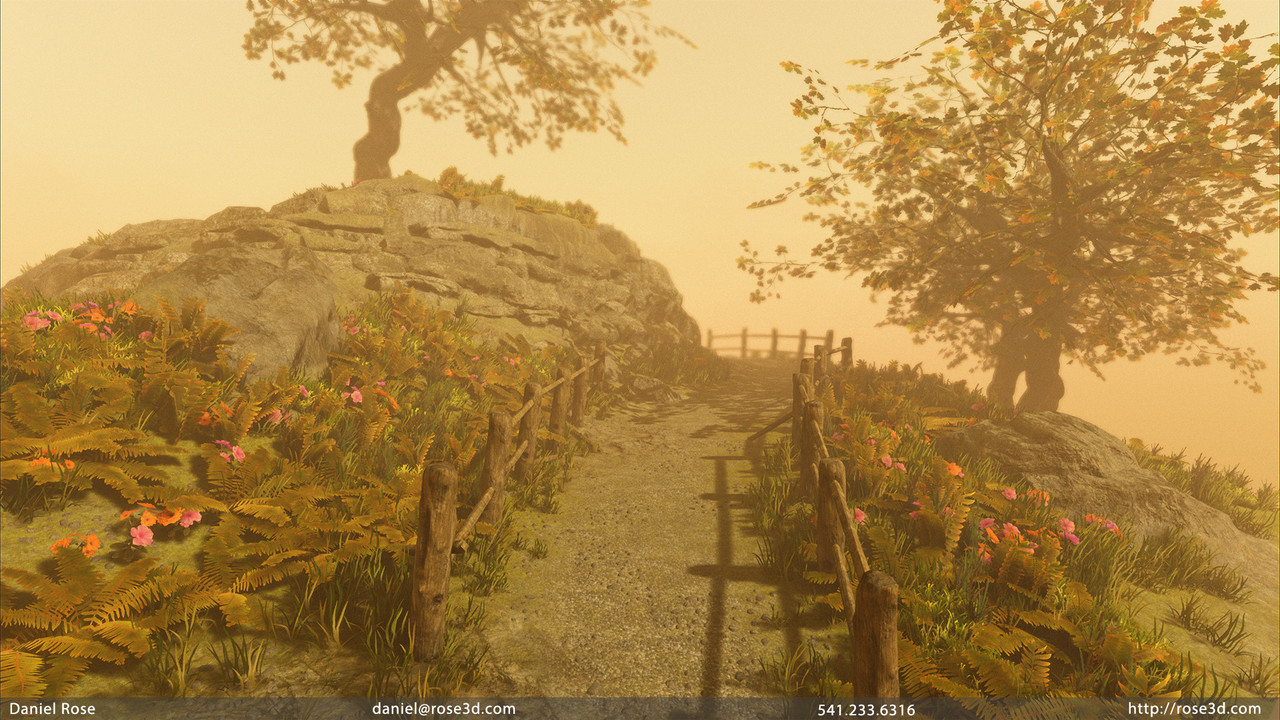
Its rare that a project comes together so quickly for me. Generally, I end up taking a while to rework assets and re-do layouts to try and really perfect my work. With The Park Bench, it was very much a sprint to the end. Its an end I am incredibly proud of even as the scope of the project changed significantly as I worked. The story of this project mirrors my last year and a half, so I think its important to share the timeline of the project before I get into the details.
The Park Bench was always intended to be a diorama. I was in Texas when I started the project and had some bigger plans for the full scene, but those larger plans still involved a smaller scene. The project lapsed when work on Shadow of The Colossus got intense, so I shelved it. I didn’t pick it back up until I started teaching at Drexel in the fall of 2017. The scope expanded as a result. This was an unfortunate side effect of using it as a demo scene for a class that focused on building environments for games. I lost the small feel and narrow focus and started making a small level (this further illustrates that one should always outline a project). Once class wrapped up and the holidays started, I let the project sit again. To be frank, this project probably would not be complete if not for two…catalytic events: GT 3.0 and DERP.
GT 3.0 is what Gametextures is calling their site improvement project. Early in the year, Tanner (the owner) and I had some varying discussions about expanding what I do for the site. It didn’t go anywhere at the time, Tanner and I both had to shift focus to other projects, but it did give me the idea to use Gametextures for the majority of my source materials. In the modern AAA game environment, artists are more and more specialized. This means that, realistically, I wouldn’t be making my own textures very often. Using Gametextures sped up my workflow immensely and let me focus on world building, modeling, and Unreal Engine technical work. GT also made it easy to maintain my lightly stylized look that the majority of my portfolio has. Without GT, its safe to say The Park Bench wouldn’t be done right now.
The other catalyst is DERP. DERP is the code name for the project that pushed me to leave freelancing, and is a story I will share in the future. As it relates to The Park Bench, DERP gave me various points in the last few months where I was not working due to missed payments or other issues. During these times, and definitely after I left the project, I focused all of my energies into The Park Bench. If DERP wasn’t such a shitty situation, TPB would not have been completed as quickly.
The Park Bench:Goals
Something is out of the ordinary as it relates to this project. I apparently didn’t write my usual Tech Document for it. Tech Documents are outlines I write for personal projects so I can keep track of the work I intend to do. While I was in Texas I was a little less organized than usual, and The Park Bench was meant to be a smaller, faster project.
So much for that.
When I picked the project back up towards the end of 2017, I mentioned in my WIP blog that I wanted to put this into VR. Since I scoped the project down to a diorama, I didn’t think VR would have been a wise choice for this particular project.
Since I didn’t have many defined goals, let’s move on to what worked well and what didn’t.
The Park Bench: Successes
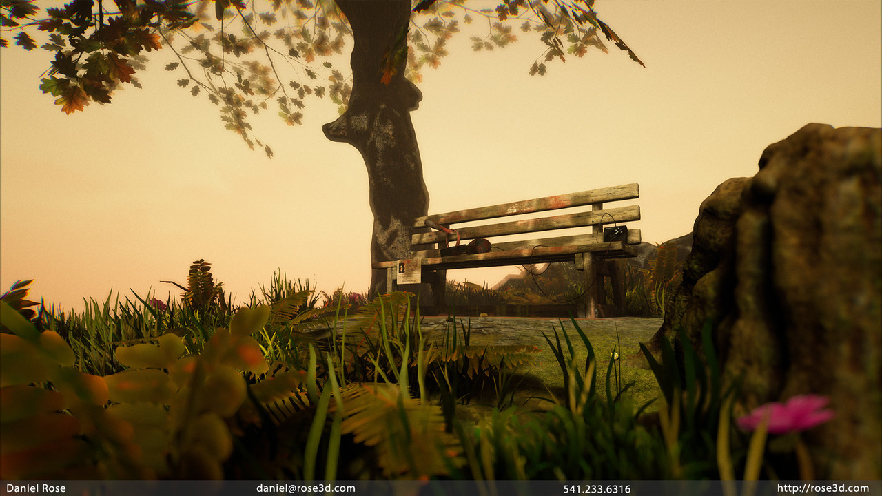
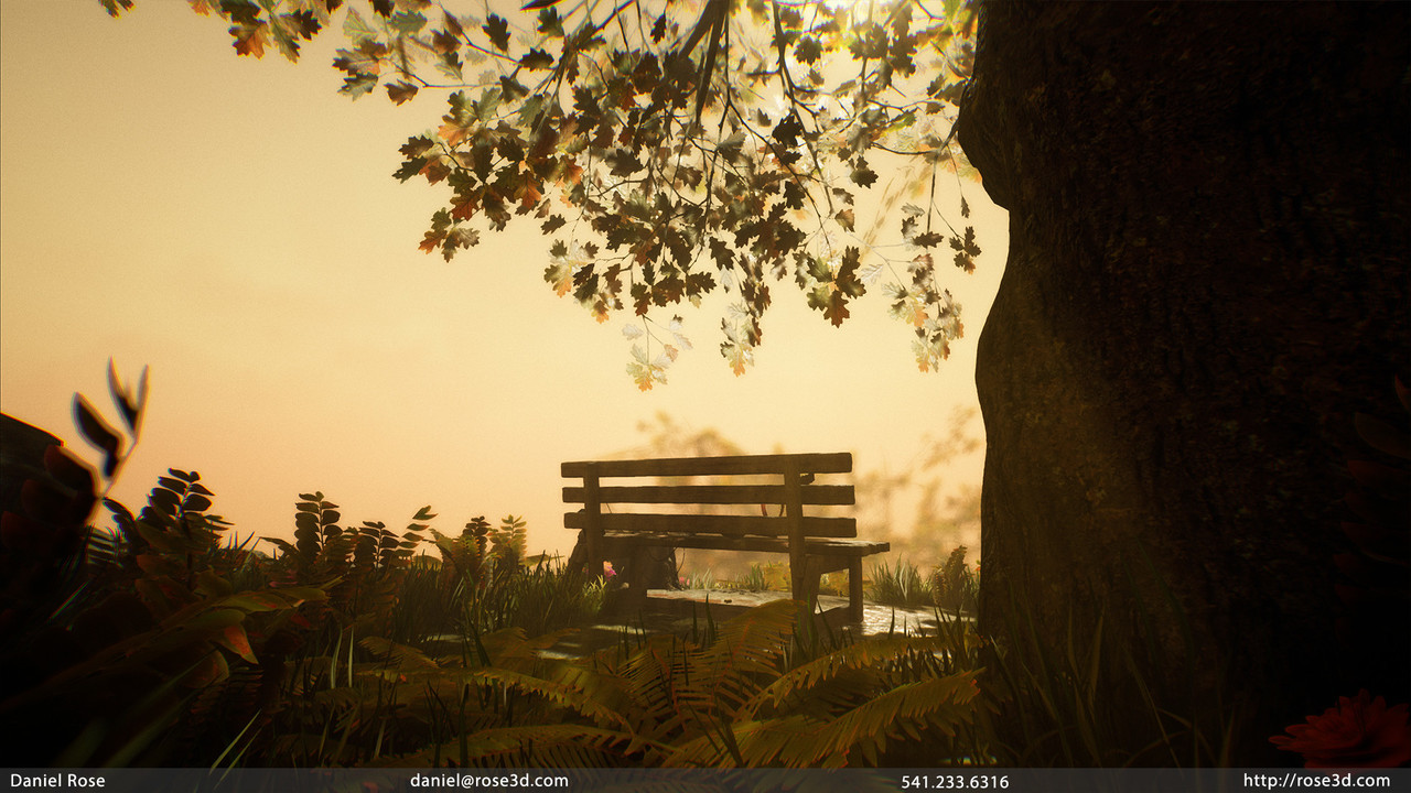
- The Diorama layout in general was a success. I had enough space for some very cool close up and player sized shots, as well as a fly through video I was able to shoot. My layout was larger than most dioramas I’ve seen but it worked well for the final version.
- My usage of Gametextures was a huge factor in making this project work. I did two different workflows; one was to use their Substances in Painter as base materials for my assets, and the other was to manually rip parts of the textures and remix them in Photoshop so I could use less individual textures and materials as needed (there was a bit of straight up tiling bitmaps used for the terrain). This workflow was mostly used on foliage to great effect.
- My continued attempts to hand model trees have improved my skills in this area. It’s still hard, and with Speedtree it’s mostly unnecessary, but I like to think it’s a good thing to have in my back pocket.
- Certain parts of my scene are full of hidden meanings and fun little messages. The paper, my choice of Metallica tape, and carvings on the bench all mean a little something.
The Park Bench: Failures
- My actual bench didn’t quite turn out the way I hopped. It’s fine…I think my biggest issue is that my UV layout was not ideal. The UV pack is fine but I could have stacked even more and mirrored some shells too.
- My rocks are still on the blobby side. I have a tendency to not sculpt very sharp rocks, and for a mellow scene like this it was ok, but I really need to focus on creating really detailed, sharper rock formations in the future.
- Stationary lighting proved to be a bit of a difficult issue in my videos and in one or two shots. Possibly due to post process settings, the two of stationary lights I used to highlight my bench would show up as very bright bulbs in a few very specific camera angles. I never figured out what was happening, and I ended up hiding them in those instances.
The Park Bench and The Shadow of The Colossus Effect
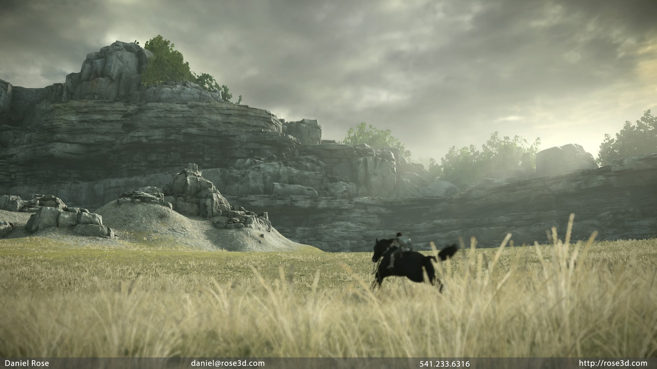
Without realizing it, my work a Bluepoint had a huge effect on how I approached portions of The Park Bench. On Shadow, there were 3 main environment techniques we used to get a large amount of variation AND consistency out of a relatively small amount of assets.
-
World Space Texture Mapping
- This is a technique where a texture is projected in world space, as opposed to being based on a UV map. This is useful for non animating asses, as a swimming effect can occur when used on a moving asset. In Shadow, as well as The Park Bench, a world space color map was used to help blend many of the rock and stone assets together. Because the texture is projected in the world, color is shared across an entire area making assets appear more unified.
-
Decal Blending
- If you’ve played a game and noticed harsh edges where cliff faces, boulders, or other areas intersect the terrain, you’re not alone. In Shadow of The Colossus, we addressed this issue by using a certain set of decal projectors to blend between the terrain and our stones. These decals varied in material, but the idea was to use them to hide those seams. I chose to do the exact same thing in The Park Bench. It worked to great effect. I added an additional twist as well. Thanks to the R&D at Gametextures, I made use of a Parallax based decal that gave some decals a more believable 3 dimensional look and feel.
-
General Decal Variations
- Most of our rocks in Shadow were textured using a fairly neutral base diffuse map, and our various world space albedo maps helped fill in the color details. However there were many, many instances where unique details were impossible. Storing variations of textures that had water runoff, sun bleaching, and other special details would have crushed our memory budgets and taken hours to make. Using decals, we were again able to add these unique details while saving on memory and time. In The Park Bench, I used them to add the same types of details to the scene, as well as to unify the different rocks even more. Additionally, the Parallax decal came in handy, allowing me to add even more blends to my ground once I hit my 16 texture sampler limit in my shader.
This shot is a great example of all three techniques I discussed above.
Its interesting what you can take away from different experiences. In my project after Golden Abyss, I tiled everything and forced Unreal 3 to render lights in real time. After WB, I focused more on my Zbrush abilities. Finally, after Bluepoint, I tied it all together with a mix of quality models, self created and sourced textures, and a greater understanding of the freedom modern technologies give artists.
Conclusion: The most 2018 Portfolio Piece
I think The Park Bench is the best work I have done and it closely mirrors the type of work many environment artists will be doing in the games industry today. I didn’t make every aspect of every asset, but I am proud of what I did make and what textures I chose to source. In a lot of ways, this project is the most 2018 of anything in my portfolio. It uses a lot of original work as well as work done from other content providers and remixes it all into something new.
View all of my The Park Bench: A Diorama work here, and take a look here for my Shadow of The Colossus work.
-Dan


